💸 Costs Update:🌻 August 2022
With today's costs our menu is 15% more expensive than it would have been in September. When you think about it like this, instead of month to month. The cost decline over the last month loses its luster.


By: Mitch Wooderson
Costs Are Down 🤠
If you want to see the prices changes from June to July you can look at them here 👇🏻
 Tuckedito
Alright, now let's look at some charts!
MoM (Month over Month) % Increase in Per Unit Cost
What is this chart is showing me?
The detail behind the chart: Prices are updated for every individual item. Once the purchase price is updated, we have a new cost for unit of measure "Per Unit".
Then, all items are grouped. We look at the % change vs the previous month for each subgroup. We gather this % change per subgroup by adding up the % change for every item in each group.
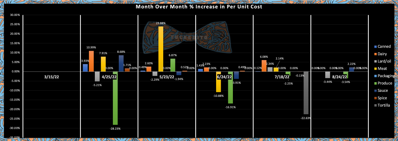
What do I see?
Up
Sauces: just ever so slightly. Pretty much not even worth reporting on, we'll take that though! I predict that in the future I'll look back and be like damn, would love a month of stable prices.
Down
Produce The price of jalapenos went down by $.25 per pound. We use a decent amount of jalapenos, so was nice to see that.
May Cost Make-up of Weekly Menu
What is this chart is showing me?
What makes up the cost of this week's menu. The prices are from this month.
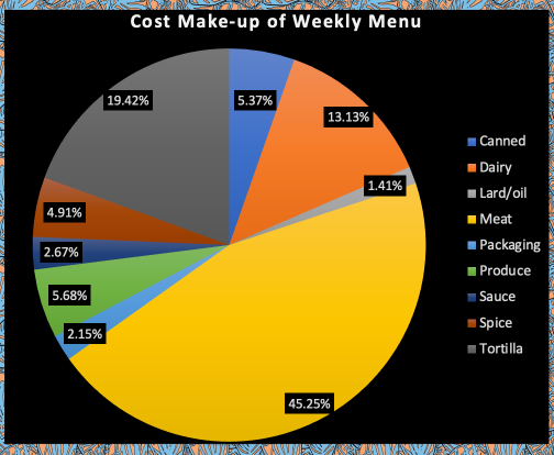
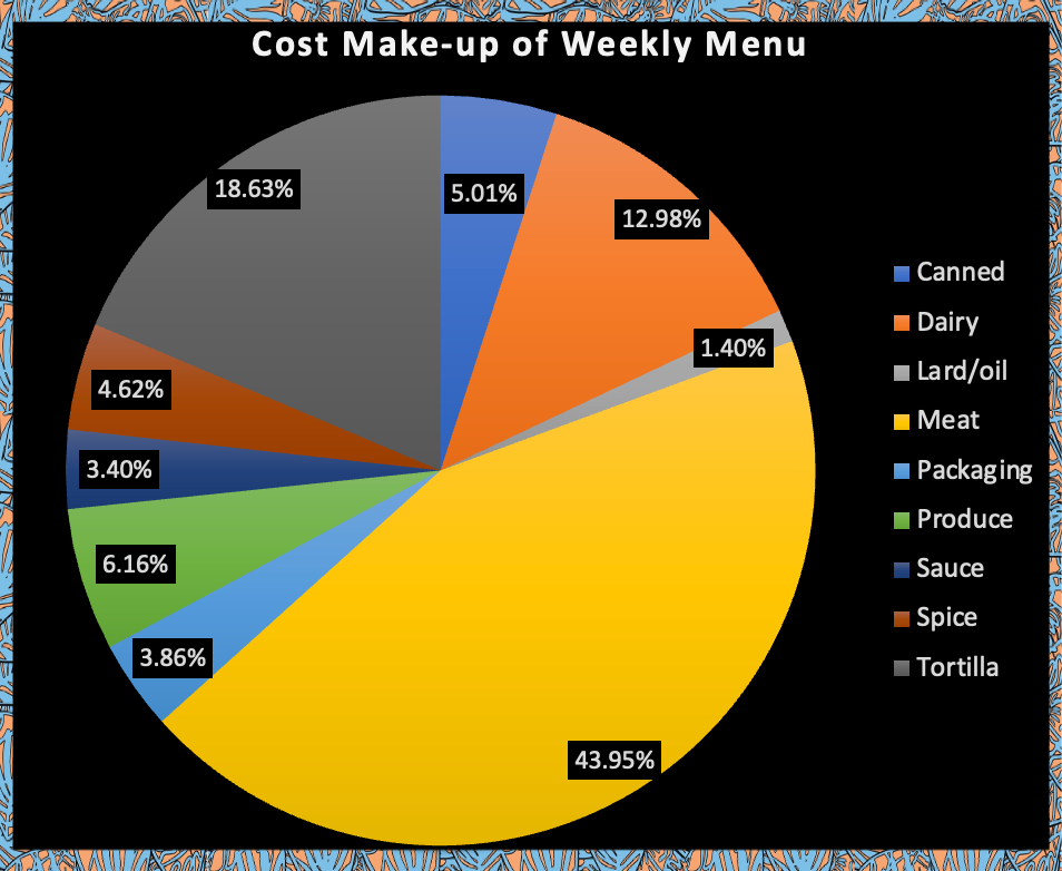
What do I see?
Produce price going down, decreased that % and it went to the meat %. Not too much change though so this looks similar to last week. Stable is ok.
We would like a downward move after the huge jumps we've seen over the last year but I do think inflated prices are here to stay. We'll have to deal with this as a new normal.
This means for the consumers that "inflated" prices at restaurants will like stay, unless there is demand destruction to the "nth" degree. There's an issue with the way our money works, but thats a topic for another day.
Cost for "Mock-up" Menu
What is this chart is showing me?
The cost of this week's menu compared to what it would cost us if we use prices from previous months.
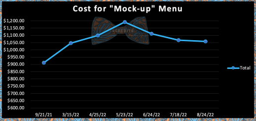
Slightly down. We're hanging in that March territory now.
Here is the % increase of the "Mock-up" Menu.
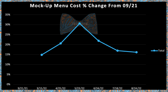
With today's costs our menu is 15% more expensive than it would have been in September. When you think about it like this, instead of month to month. The cost decline over the last month loses its luster.
What do I see?

Prices are downnnn, again. Over the last month. Way up on the year though. We can only hope we are not saying the same thing come next August.
Would love some better ways to look at prices. If you're reading this and have useful ratios or charts I can try out, I'd love to hear from you!
Send suggestions to: tuckedito@gmail.com, instagram dm, fb dm